info
BridgeU is a university guidance platform that connects 16–18 year-old students in their final years of school to universities around the world
The web app asks students about countries + courses they're considering studying in for uni as well as things like their predicted grades
The algorithm then begins to suggest potential uni matches based on their answers
Of the OKRs set by the business in 2023, my squad was tasked with focusing on the following:
Increase the average number of unique platform sessions per 2024 grad class student from 5 to 10
Increase the % of 2023 grad class students with 3+ shortlisted unis/courses from 45% to 70%
This led us to identify opportunity areas within the product where we felt we could create the biggest impact and shift the needle. We had long heard from students that our lack of data in UK course profiles (e.g. Biology at University of Cambridge) drove them off of BridgeU and to Google/competitors.
Given that the UK was one of our biggest markets in terms of destinations, the decision was made to plug this gap by increasing our data coverage for UK course profiles.
My role: Product Design Lead
Duration: 3 months
Tools: Mobbin, Figma/Figjam, Zoom, Maze
I worked in close collaboration with:
the Product Manager to align our vision
the dev team to garner feedback on the technical feasibility of different design ideas
the data team to learn about data coverage
Students in the 2023 grad class who are in the process of researching unis and courses.
bar_chart
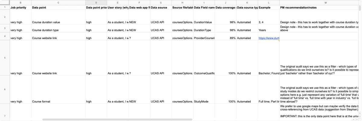
As part of the project initiation, the Product Manager shared a spreadsheet outlining BridgeU's requested data points for inclusion on UK course profile pages. Insights from our data team confirmed their availability from existing sources.
During discussions with the PM, I observed that some data points were already categorized according to the jobs-to-be-done framework, a result of prior user research. This insight provided early context on each category's purpose and potential grouping.
An early consideration was the data coverage column, sorted from high to low. This aided in assessing the completeness of the 24 data points and anticipating potential empty states. Such foresight allowed for proactive handling of edge cases.
Building on previous JTBD framework categorization, I aimed to elevate our approach.
Questions arose:
Is the old JTBD grouping relevant for the 2023 grad class?
Which data points truly matter to students?
To answer these questions, I believed the most diligent approach would be a card sorting exercise. This method would unveil the ideal information architecture for an impactful user experience and clarify data point prioritisation.
Leveraging Maze, I orchestrated a closed, unmoderated card sort, tasking users to:
Group data points by theme
Prioritise themes by importance
Here's a snapshot of insights gleaned from 46 student responses:
100% (all 46) of students believed that "international fees" and "domestic fees" belonged in the same group
trending_flat
Of the 46 students, 89% (41 students) prioritised sorted this group as "very important"
87% (40 students) sorted "application deadline", "course duration", "study mode" and "qualification" into one group
trending_flat
Of the 40 students, 38 students) prioritised sorted this group as "very important"
66% (27 students) did not assign "Module information" to a group
trending_flat
Of the 27 students, 20 students prioritised sorted this group as "least important"
We discovered that prioritizing fees, application deadlines, and course information above the fold was crucial, while module details could be placed below the fold without impacting the user experience.
While awaiting card sort results, I delved into competitor analysis. Despite many competitors being behind paywalls, I scoured BridgeU's Slack for insights.
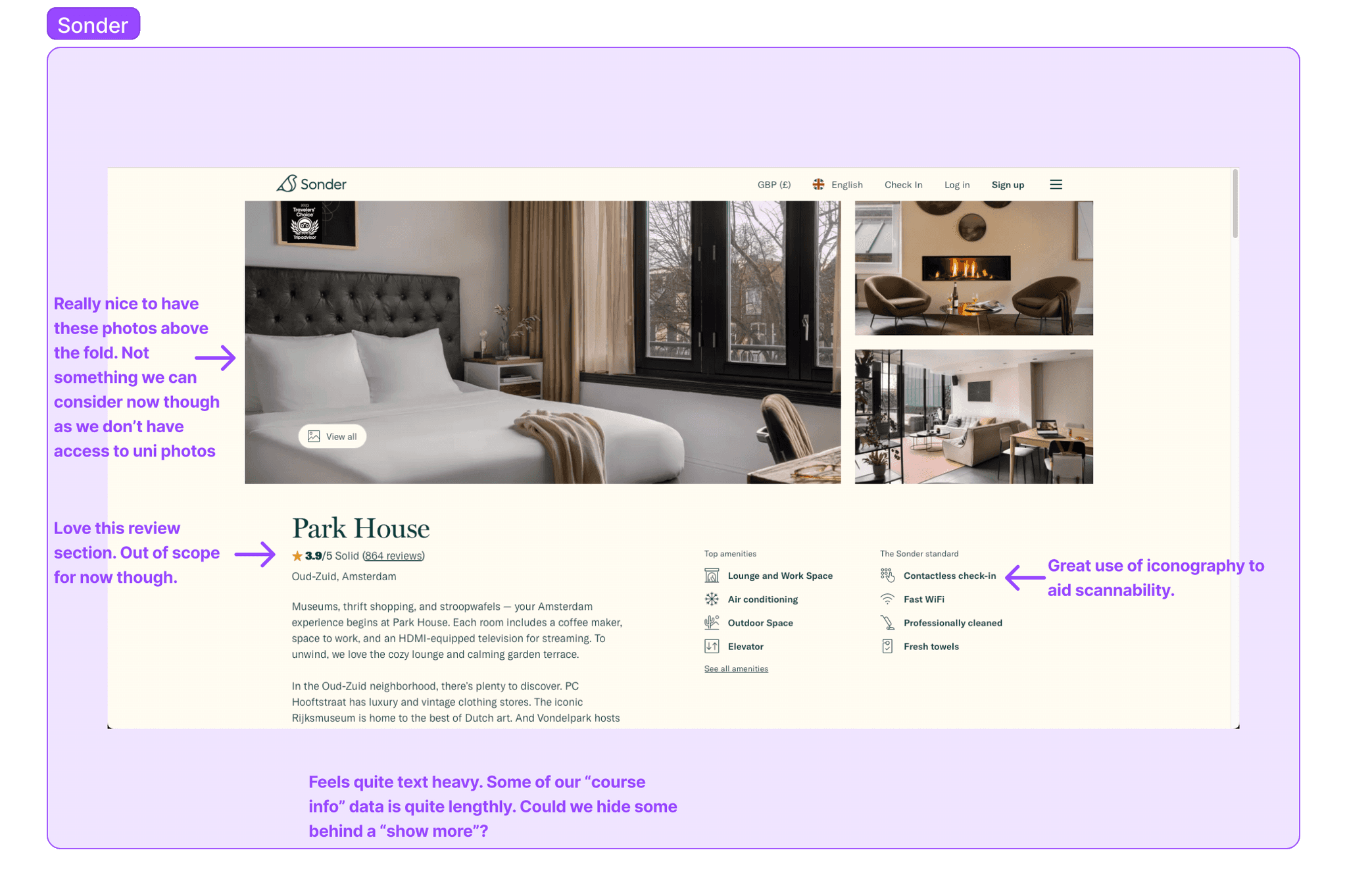
With little luck, I expanded my search beyond EdTech. Mobbin provided design inspiration for visually compelling data presentation. I also explored profile pages from travel and car industries—Airbnb, Plumguide, Sonder, and Cazoo.
This research marked a pivotal moment. I discovered these companies didn't reinvent the wheel but strategically incorporated design patterns. Minimal fancy artwork; instead, a blend of iconography, typography, color, and whitespace highlighted key details.
Presenting my findings to the team, I proposed striking a balance between emulating this approach and retaining BridgeU's visual identity.

My exploration of the problem space progressed well, collaborating closely with the team. Yet, we faced the challenge of integrating 24 data points into UK course profiles. Our approach:
Break down the 24 data points into manageable deliverables, guided by card sort results.
Prioritize high-value data first, based on card sort insights.
Utilize Trello cards for tracking progress in stand-ups, addressing blockers promptly.
Adopt an incremental launch strategy, releasing chunks of work as they're ready.
Provide weekly sprint estimates for development, data, and design sign-offs.
This method allowed for effective workload prioritisation, ensuring alignment with development progress while finalising designs for upcoming deliverables.
lightbulb
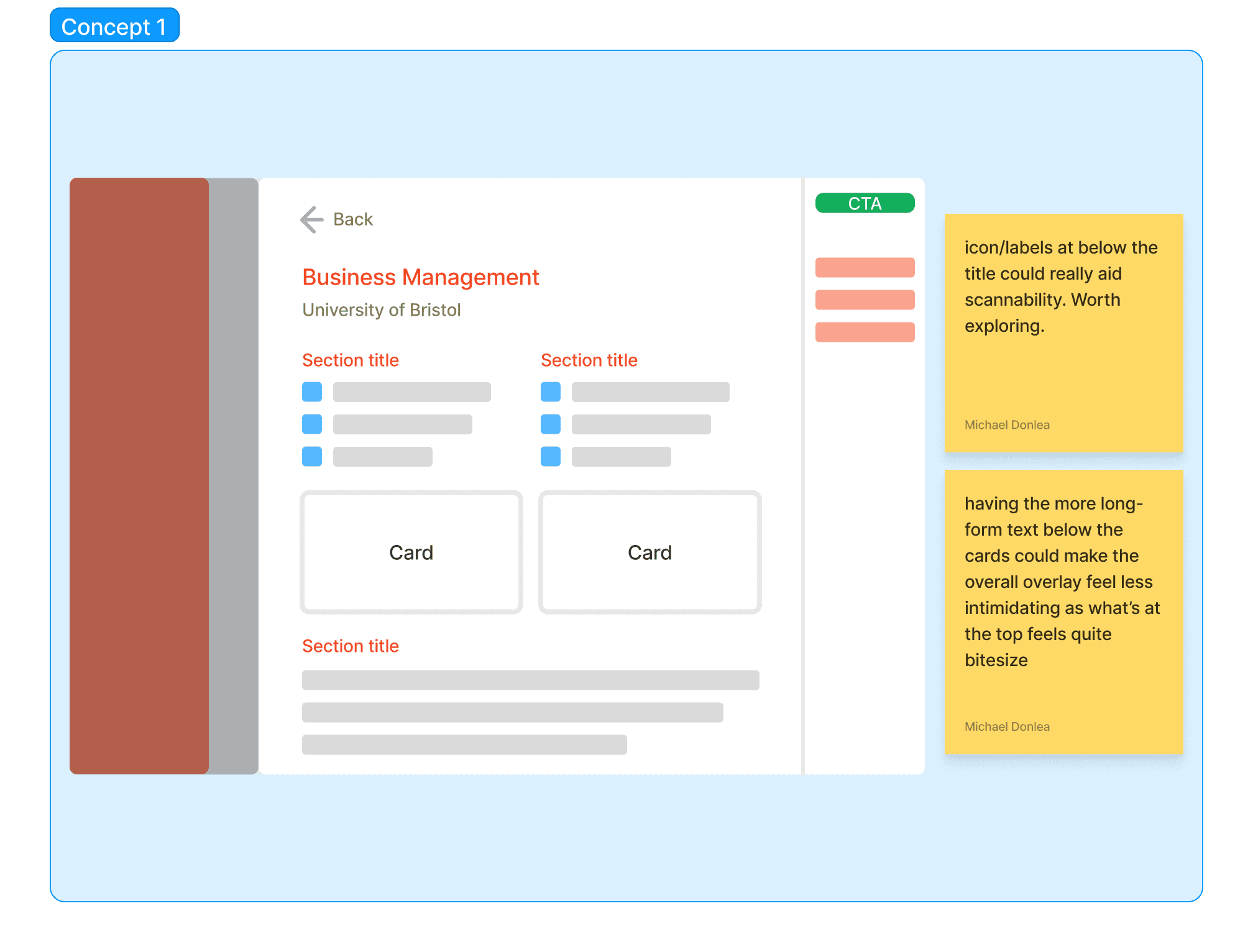
Drawing from earlier insights, I explored varied layouts in FigJam. Leveraging existing BridgeU patterns, I integrated side-by-side cards and long-form content into concept 1.
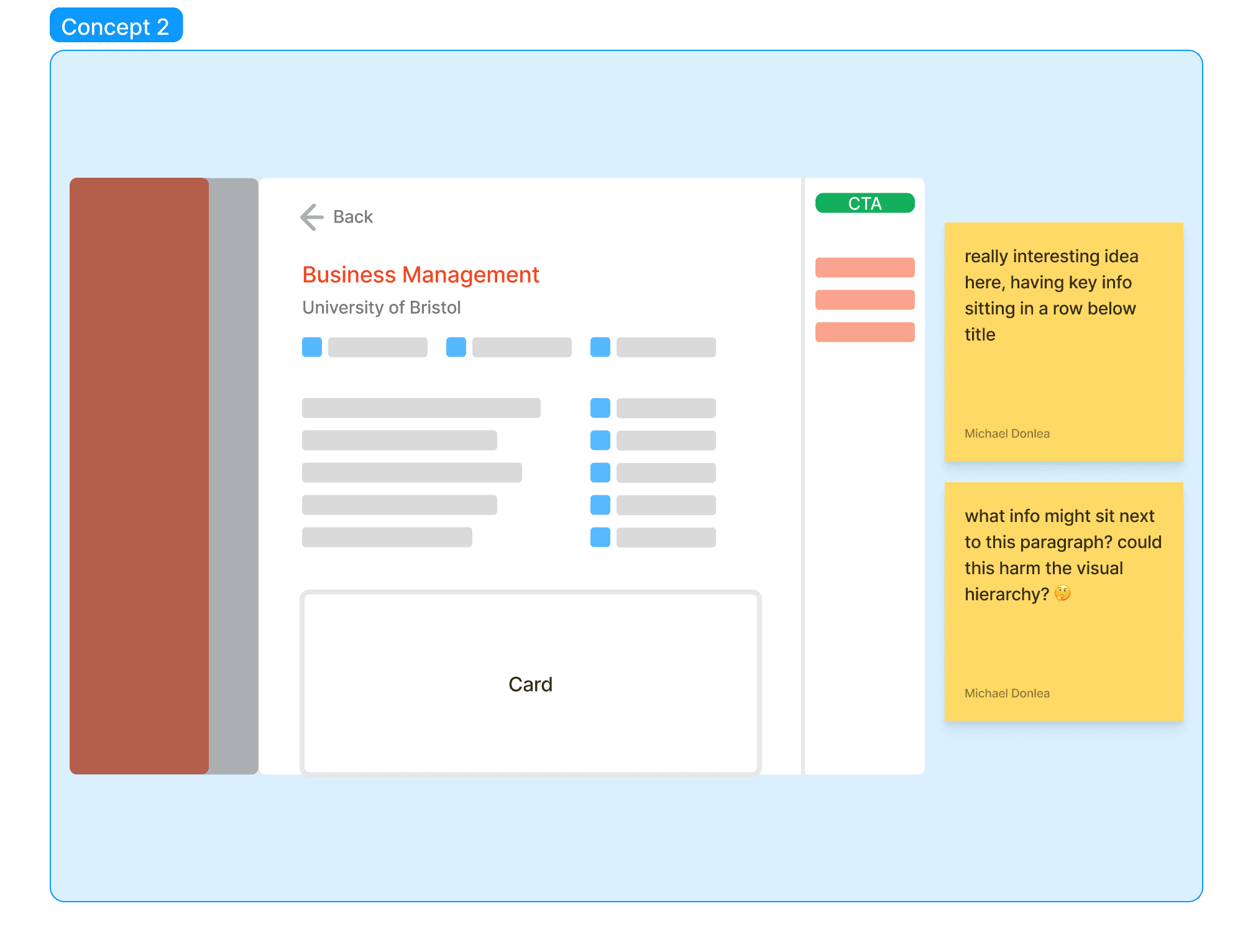
Yet, I pushed boundaries with new ideas: concept 2 introduced icon rows for key info, while concept 4 featured interactive cards for CTAs.
In a Zoom session, I presented these concepts to the PM and devs, emphasising existing BridgeU elements versus some of my new ideas.

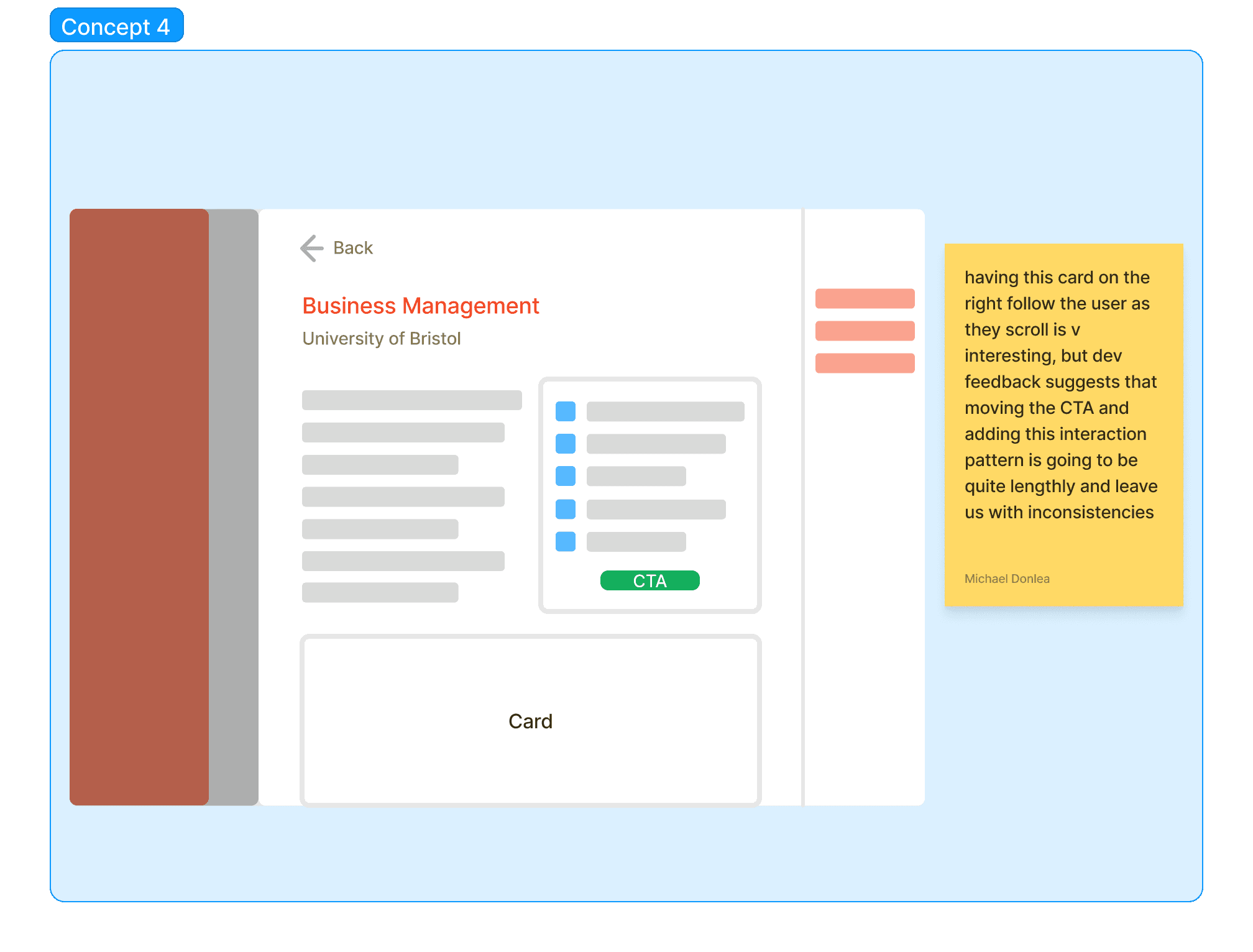
The devs' feedback proved invaluable:
Concept 1's side-by-side cards are a simple, reusable component ✅
Icon-style design in concept 2 was feasible ✅
Concept 4's interactive card is challenging due to team skillset and time constraints ⛔️
Considering these insights and team discussions, I opted against a singular concept. Instead, I blended strengths from each for high-fidelity exploration post-card sorting.
After compiling card sort results and team discussions, it was time to focus on refining concepts in higher fidelity.
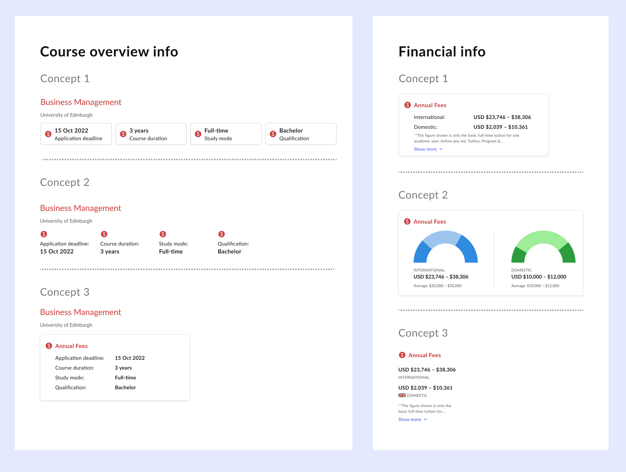
I organised the canvas by themes and explored diverse design patterns, noting existing ones in BridgeU and drawing inspiration from travel websites.
Aware that my work would impact the broader product, I led a design review to share my explorations with the team. We evaluated patterns for merits, drawbacks, scalability, and potential use elsewhere.
Following this, I gathered feedback from devs on build time estimates and pattern efficiency.
Here's a snapshot of some of the patterns I explored.
rocket
Now, I had to select optimal design patterns for each point of data (PoD).
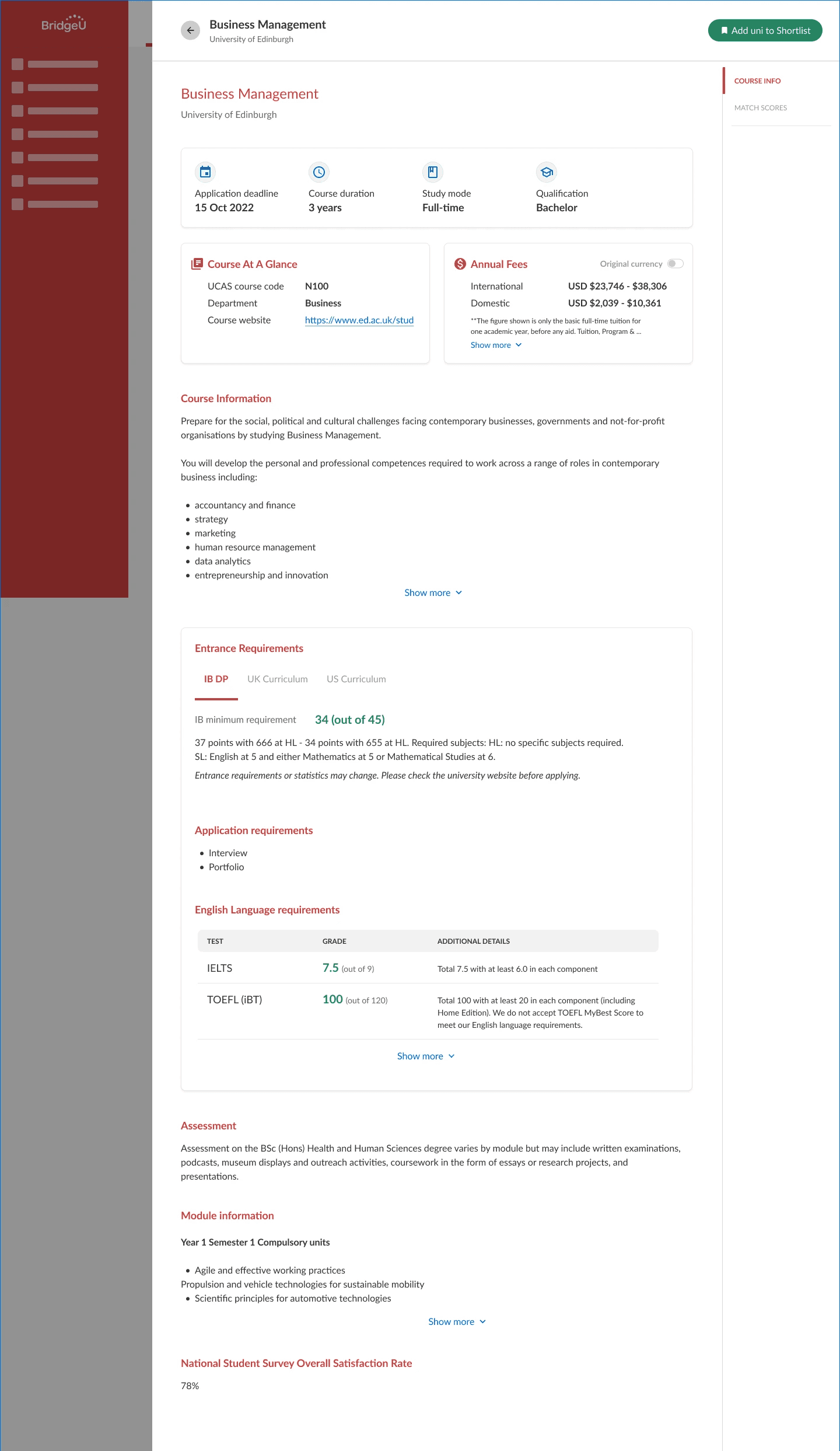
Students prioritised application deadlines, course duration, study mode, and qualifications.
To maintain symmetry, I adapted concept 2, placing these PoDs within a card, with tweaked blue icons for emphasis.
For text-heavy sections like "Course Information" and "English Language Requirements," I used a "show more" feature and tabular format, respectively, building on existing BridgeU patterns.
Considering the lack of horizontal space on mobile, I also swapped out a scrolling tab for a filter pattern to make better use of space.
trending_up
Shortlisting
north
17%
Increase in students shortlisting from a UK course profile
Drop-offs
south
22%
Reduction in users exiting a profile within 30 seconds of arrival
psychology
Biggest challenge
Time constraints led to omitting user testing. However, given the IA questions I had, prioritising card sort felt justified.
A failure
Refining design patterns earlier, like omitting concept 2 for financial info, could've expedited project completion.
Most proud of
I'm very happy that I delved into the audit spreadsheet early. Prioritising data coverage ensured thorough consideration of edge cases in my handoff.
An unexpected learning
I anticipated finding intricate design patterns in my inspiration yet found simplicity to be far more effective. This reinforced how mastering simplicity is such an invaluable skill in UI design
Next steps
Whilst it was out of scope for this project, past user interviews identified additional valued data points like graduate employment rate and financial aid info. Future collaboration with the PM to assess opportunities for integration of these and other data would have been ideal.
The final designs balanced relevant patterns with BridgeU's visual language. However, unrelated profile pages now seem dated. I would have loved to explore where and how I could implement these new patterns in appropriate areas across the product.
More work

BridgeU
Redesigning search
Learn how I spearheaded the redesign of search, resulting in a 15% increase in profile views 🎉
View case study
arrow_forward

